A blank chat box looks flexible. It can also make a user do all the product design: invent the right prompt, guess what the system can do, and hope the reply includes the correct next step.
For many workflows, a better interface feels more like a cockpit. The user sees a small number of relevant actions, the information behind them, and what will happen when they choose one.
Turn capability into a visible choice
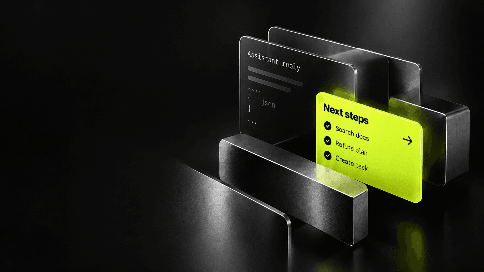
Start with a real moment in the workflow. After a support ticket is summarized, the user may want to draft a response, find a related issue, or route it to another team. Offer those actions when they become relevant instead of listing every capability at the top of the conversation.
Each action should have a clear label and enough context to answer three questions: What will the system use? What will it change? Can I review the result first? “Draft a reply using the order history” is more informative than “Continue.”
Keep proposals separate from consequences
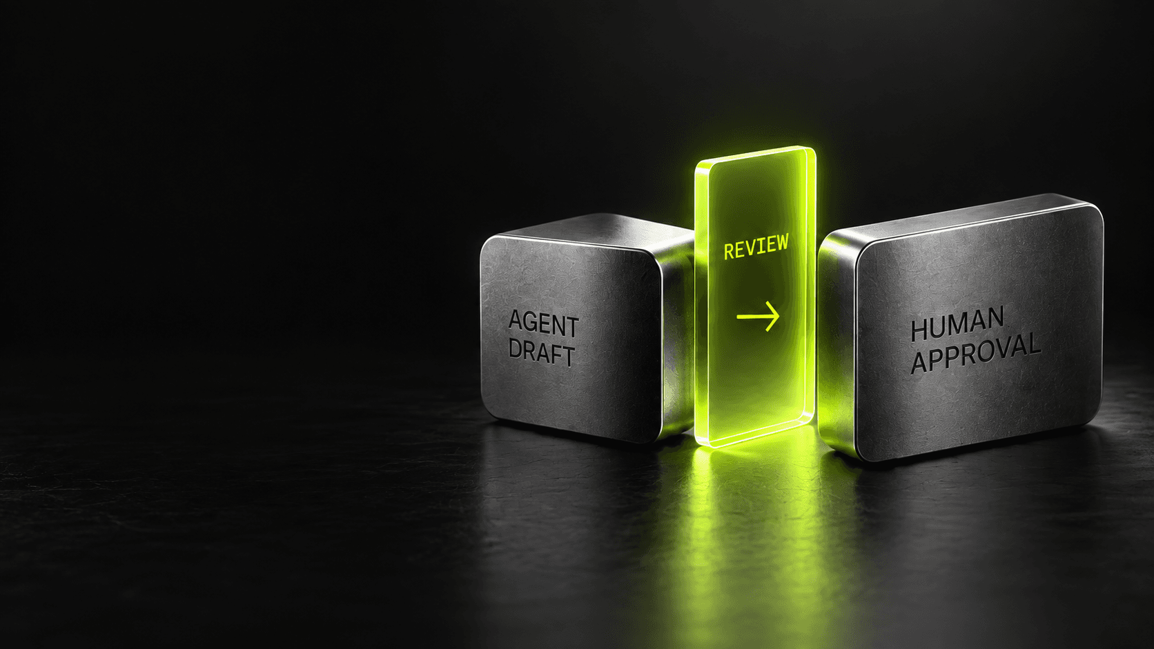
The interface should distinguish a suggestion from an action that has already happened. Let users edit a draft, inspect its source, and confirm consequential changes. A proposed refund is not a processed refund; a prepared email is not a sent email.
That distinction also makes correction easier. If the user can point to a specific step—wrong account, outdated source, or mistaken recipient—the system can revise the proposal without starting the entire interaction over.
Design for the next screen, too
When an action moves work into a form, timeline, or record view, carry its context along. Do not make people copy a generated answer into another screen or repeat information they already provided. Preserve the option to go back, change the request, or decline the suggestion.
Measure whether actions are understood and useful: how often users accept, edit, dismiss, or undo them; where they abandon the flow; and whether the work actually reaches a completed state. A high click rate is not proof that an action helped.
Good agent UX is not chat with more buttons. It is a clear, navigable workflow where the user can see what the system knows, choose what happens next, and remain in control.