

A response that appears one word at a time can look busy without helping anyone. If the system is still gathering data, calling a tool, or waiting for a decision, a typing animation hides the important question: what is happening, and when can I use the result?
Streaming is an interface choice. Design it around the work, not around the fact that a model can emit tokens incrementally.
Show meaningful progress
For a short answer, a simple loading state may be clearer than partial text. For a longer task, show stages such as “Searching project notes” or “Comparing options.” These labels help users understand why the task is taking time and what the system is doing.
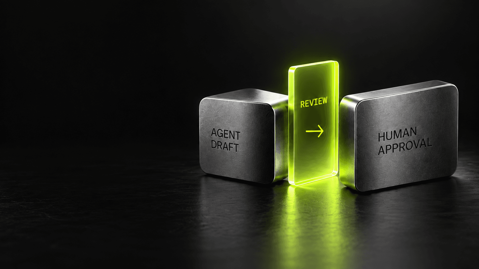
If partial output is useful, make its status obvious. A draft summary can be edited while sources are still loading; a final recommendation may need to wait until those sources have been checked. Do not let unfinished text look like a verified result.
Keep the interface stable
As new content arrives, avoid moving the user's reading position unexpectedly. Let them scroll away and catch up at their own pace. Keep the stop or cancel action available, and preserve already completed work when a later step fails.
Tool results deserve the same clarity as model text. If the system found three of five records, say so. If a service is unavailable, distinguish that failure from “no results.” Clear status is more valuable than a smooth animation that conceals uncertainty.
Measure perceived speed and usefulness
Track time to first useful information, time to completion, abandonment, and whether people had to repeat their request. A fast first token is not a win if the answer takes longer to understand or arrives in an unstable layout.
The goal is not to make every wait look instantaneous. It is to make the wait legible, the partial work trustworthy, and the finished result easy to use. That is product design—not a typing effect.